Order Total (1 Item Items):
Shipping Destination:

Alphabets by Zapf Hermann (25 results)
Skip to main search results
Search filters
Product Type
- All Product Types
- Books (25)
- Magazines & Periodicals (No further results match this refinement)
- Comics (No further results match this refinement)
- Sheet Music (No further results match this refinement)
- Art, Prints & Posters (No further results match this refinement)
- Photographs (No further results match this refinement)
- Maps (No further results match this refinement)
- Manuscripts & Paper Collectibles (No further results match this refinement)
Condition Learn more
- New (No further results match this refinement)
- As New, Fine or Near Fine (7)
- Very Good or Good (10)
- Fair or Poor (No further results match this refinement)
- As Described (8)
Binding
Collectible Attributes
Language (3)
Free Shipping
- Free Shipping to U.S.A. (No further results match this refinement)
Seller Location
Seller Rating
-

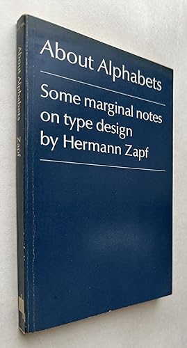
About Alphabets
Seller: Friends of SMPL Bookstore, Santa Monica, CA, U.S.A.
Seller rating 5 out of 5 stars

Soft cover. Condition: Good. Sub title, some marginal notes on type design.
-
About Alphabets: Some Marginal Notes On Type Design
Language: English
Published by M.I.T. Press, Cambridge, 1970
ISBN 10: 0262740036 ISBN 13: 9780262740036
Seller: BIBLIOPE by Calvello Books, Oakland, CA, U.S.A.
Seller rating 4 out of 5 stars

Paperback. Condition: near fine(-). First MIT Press paperback editoin. 142 pages illustrations, portrait 19 cm. Nice copy. ? Caract?res d'imprimerie Sp?cimens, Imprimerie Sp?cimens, Printing, Printing Specimens, Specimens, Type and type-founding, Type and type-founding Specimens, Zapf, Hermann, type specimens (documents Graphic Design; Typographer. Book design Printing; Language. Small edge stain, minor edge-wear and faint creasing to front wrap fold; else near fine(-) thus and apparently unread -- or very lightly read.
-

Paperback. Condition: Very Good. Second Edition. Mass market paperback. Second edition of 1960 original. Slight wear to corners and edges; slight rubs and creasing to spine; slight browning to page edges and inside cover; small previous store sticker on back left corner; date and price from previous store on front endpaper; otherwise tight, sound and unmarked in Very Good condition. ; 142 pages.
-

Soft cover. Condition: Very Good. No Jacket. Clean interior with tight binding; cover lightly worn.
-
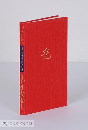
ABOUT MORE ALPHABETS: THE TYPES OF HERMANN ZAPF
Language: English
Published by The Typophiles, New York, 2011
ISBN 10: 0984274405 ISBN 13: 9780984274406
Seller: Oak Knoll Books, ABAA, ILAB, NEW CASTLE, DE, U.S.A.
Association Member: ABAA ILAB MBS
Seller rating 5 out of 5 stars
hardcover. Zapf, Hermann (illustrator). 4.5 x 7 inches. hardcover. 112 pages. Foreword by Robert Bringhurst. Typophiles Chapbook, New Series, 3. "Letterforms are things that nearly all of us in the Western world have learned to take for granted. We treat them much like door knobs, water taps, thermostats, and hinges. We evidently think (in defiance of all logic) that what we read or write matters far more than how it's read or written, and that letterforms are just a way to get there, as a door knob is a way to open a door," writes Robert Bringhurst in the Foreword to About More Alphabets. This book hopes to bring attention to a neglected topic by focusing on the letterforms of Hermann Zapf. From metal type to the digital characters, Hermann Zapf has composed exceptional type designs for seventy years. He can be considered one of the most important calligraphers of all time, as well as a most notable book designer and typographer. His typefaces are among the most beautiful and familiar in the world. This book, a companion volume to the Typophile Chapbook About Alphabets (1960, updated 1970), describes Zapfs post-1970 type designs and provides new research on many of the earlier types. In this volume, typographer and calligrapher Jerry Kelly describes the origins and history of numerous Hermann Zapf typefaces including Marconi, ITC Zapf International, Linotype Zapfino, and Zapf Civilit�. Kelly also includes new information on the Palatino nova and Optima nova families. This new Typophiles Chapbook is profusely illustrated with type specimens and drawings, many of which have never before been reproduced. Illustrations include drawings by Zapf, comparisons of various types, early sketches, typefaces never issued, and a twenty-eight page image section of type specimens. Other types described include Hallmark Textura, AMS Euler fraktur bold, Zapf Renaissance italic swash, Medici script, Aurelia, AMS Euler, Zapf Renaissance, ITC Zapf Chancery, and Zapf Civilit�. Robert Bringhurst calls Zapf one of historys greatest two-dimensional architects. He says, "Hermann Zapf has made letters so subtle, so lovely they bring tears to knowledgeable eyes. And there are very few people who know Zapfs work as well as Jerry Kelly. Read him and weep.".
-
Spend Your Alphabets Lavishly: The Work of Hermann and Gudrun Zapf, Catalogue of an Exhibition at the Melbert B. Cary, Jr. Graphic Arts Collection, Rochester Institute of Technology
Published by The Typophiles, in association with RIT Cary Graphic Arts Press, Rochester, 2007
Seller: Sanctuary Books, A.B.A.A., New York, NY, U.S.A.
Seller rating 5 out of 5 stars
Paperback. Condition: Fine. Wraps. Printed in black and blue, and illustrated throughout.
-
About Alphabets-Some Marginal Notes On Type Design
Language: English
Published by The Typophiles, 1960
First Edition
Hardcover. Condition: Very Good. No Jacket. 1st Edition. 1st edition. Hardbound, no dust jacket. Minor wear & discoloration to boards, otherwise very good.
-
About Alphabets: Some Marginal Notes on Type Design
Published by The MIT Press, London, 1970
Seller: Minotavros Books, ABAC ILAB, Whitby, ON, Canada
Seller rating 5 out of 5 stars
First Edition
Soft cover. Condition: Fine. 1st Edition. Blue paperback, 153pp. Wear to spine and corners, otherwise fine.
-

ABOUT ALPHABETS: SOME MARGINAL NOTES ON TYPE DESIGN
Language: English
Published by The M.I.T. Press, Cambridge, Massachusetts, 1970
ISBN 10: 0262240106 ISBN 13: 9780262240109
Seller: David H. Gerber Books (gerberbooks), Austin, TX, U.S.A.
Seller rating 5 out of 5 stars
Hard Cover. Condition: Very Good. Dust Jacket Condition: Very Good. [143]pp [rubbing and edge wear to dust jacket; spine cocked] This is a revised edition of the Typophile Chap Book No. 37 first issued in 1960. Size: 12mo - over 6�" - 7�" tall.
-
Soft cover. Condition: Good. No jacket. Cover is shelf worn and slightly rubbed with a crease on the bottom corner edge. The edges are worn, particularly the outer edge. Spine is creased, but binding is secure. Inside is clean and unmarked.
-
ABOUT ALPHABETS. Some Marginal Notes on Type Design.
Language: English
Published by Typophiles, New York, NY, 1960
Seller: Kurt Gippert Bookseller (ABAA), Chicago, IL, U.S.A.
Association Member: ABAA ILAB MWABA
Seller rating 5 out of 5 stars
First Edition
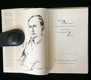
Hardcover. Condition: Very good- condition. First Edition. 118 pages of text. Original hardcover binding is slightly shelfworn. The leather spine label is somewhat unevenly discolored. The previous owner has handwritten the author's name and a shortened title in red and black ink. Illustrated with a frontisportrait of the author, and numerous tipped-in double-page plates. Limited edition, this one numbered 174 and signed by the author on the colophon. The text is clean and unmarked. Height: 180mm. Translated from the original German by Paul Standard. First edition in English.
-
About Alphabets: Some marginal notes on type design.
Published by 16mo, pp.142, colophon, The M.I.T. Press, Cambridge, Mass., 1970., 1970
Soft cover. Condition: Near Fine. Frontispiece drawing by Gi Neuert-Hoffman; many plates and illustrations, set in Linotype Optima & printed by Ludwig Oehms. Semi-stiff card covers, titled in white, slightly worn at the edges. A fine copy. A revised edition of Typophile Chap Book No.37.
-
About alphabets;: Some marginal notes on type design
Seller: A Squared Books (Don Dewhirst), South Lyon, MI, U.S.A.
Seller rating 5 out of 5 stars
hardcover. Condition: Very Good. Dust Jacket Condition: Good. 1970. Blue cloth covered boards with gold spine titles; mild wear; jacket has mild edge wear and rubbing; 12mo, 6 3/4" to 7 3/4" tall; interior is clean and unmarked; 142 pages.
-
PEN AND GRAVER Alphabets and Pages of Calligraphy
Language: English
Published by Museum Books Inc., New York, 1952
Hardcover. Condition: Very Good. Hermann Zapf (illustrator). Quarter vellum gilt with Fabriano paper-covered blind stamped boards, landscape 4to., 25, (5) leaves, illustrated by Hermann Zapf with metal engravings cut by hand by August Rosenberger. One of 2,000 copies printed by the D.Stempel AG type foundry in Frankfurt, in black and brown on Fabriano paper. Text set in Palatino. A clean, very good copy with minor wear and light toning to the spine and with the gilt title faded.
-
Pen and Graver: Alphabets & Pages of Calligraphy
Language: English
Published by Museum Books Inc., New York, 1952
First Edition
Hardcover. Condition: Near Fine. 1st Edition. Beautiful book, tight and square with bright covers and spine, clean unmarked interior. Sturdy binding. Attractive custom bookplate on front pastedown.
-
About Alphabets, Some Marginal Notes on Type Design (Typophiles Chap Books XXXVII)
Published by The Typophiles, New York, 1960
Seller: Swan's Fine Books, ABAA, ILAB, IOBA, Walnut Creek, CA, U.S.A.
Association Member: ABAA ILAB IOBA
Seller rating 5 out of 5 stars
Signed
Hardcover. Condition: Very good +. One of 300 signed and numbered copies, duodecimo size, 118 pp. total, this volume signed by Hermann Zapf. Hermann Zapf (1918-2015) was one of the most influential typographers of the early digital age, having a career that "spanned the glory days of hot metal composition right through to the rise of the Apple Mac"; his creations continue to inspire today. Interestingly, it is Zapf's "dingbats" that may have had the biggest impact on modern communication: these formed the basis for Unicode's symbols, which in turn paved the way for the now-ubiquitous emoji. This volume signed by Zapf at the colophon, being no. 102 of the edition (both the signature and number in blue ink). ___DESCRIPTION: Bound in full blue cloth over stiff cardboard, brown leather spine label with gilt lettering, the frontispiece a reproduction of a photograph of Zapf, replete with typographic designs, several being double-page; duodecimo size (7" by 4 1/2"), pagination: [1-6] 7-117, [1, colophon], this one of 300 signed/numbered copies (total English edition 700 copies; there were also 1300 copies printed in German). ___CONDITION: Better than very good: the cloth binding clean overall and without wear, all corners perfectly straight and unrubbed, a strong text block with solid hinges, the interior clean and bright, and the sole prior owner marking we see a gift inscription on the flyleaf dated "vii.62"; we would have graded this book fine except for (i) an old damp-stain at the head of the spine which has darkened the leather spine label and the cloth at the very top, and (ii) foxing to the edges of the text block. Even with its few faults, still special with Hermann Zapf's signature. ___POSTAGE: International customers, please note that additional postage may apply as the standard does not always cover costs; please inquire for details. ___Swan's Fine Books is pleased to be a member of the ABAA, ILAB, and IOBA and we stand behind every book we sell. Please contact us with any questions you may have, we are here to help.
-

About Alphabets. Some marginal notes on type design.
Published by Cambridge, Mass, USA: The M.I.T. Press, 1970., 1970
Seller: OJ-BOOKS ABA / PBFA, SOLIHULL, United Kingdom
Seller rating 4 out of 5 stars
A revised edition of the Typophile Chap Book No. 37 first issued in 1960. Set in Linotype Optima and printed in offset by Ludwig Oehms, Frankfurt a.M. Bound in blue cloth by the Ladstetter bindery, Hamburg, gilt lettering to the spine. Clear, removanle, archival protective sleeve fitted to the printed dust-jacket. 12mo, 182 x 120 mm, pp. 144. A book in Very Good condition with feint offsetting on free endpapers.
-
Cambridge / Mass. & London: The M.I.T. Press, 1970. Blue-black Orig.-cloth with blue dust-jacket. 142, (1) pages with a Frontispiece drawing of H. Zapf by Gi Neuert-Hoffmann and numerous type specimens and print type samples. - 18 x 11,5. * Englische Textausgabe mit 3-zeiliger handschriftlicher pers�nlicher Widmung und Signatur von Hermann Zapf an Dr. Helmut Presser, den damaligen Direktor des Gutenberg-Museums in Mainz.
-
ABOUT ALPHABETS: SOME MARGINAL NOTES ON TYPE DESIGN
Published by MIT Press, Cambridge MA, 1970
Seller: Johnnycake Books ABAA, ILAB, Salisbury, CT, U.S.A.
Association Member: ABAA ILAB SNEAB
Seller rating 3 out of 5 stars

Hardcover. Condition: Fine. Dust Jacket Condition: Fine. 1st Edition Thus. A fine copy in fine dustjacket of the 1970 edition by MIT Press after the firts of 1960 with a new introduction by typographer and type designer Zapf. Neatly signed by him on the title page in pencil. A lovely copy.
-

About Alphabets. Some marginal notes on Type Design. -
Published by Cambridge/Mass., London: The M.I.T. Press, 1970
Seller: Antiquariat Tautenhahn, L�beck, Germany
Association Member: GIAQ ILAB VDA
Seller rating 5 out of 5 stars
142 (2) Seiten, Fadenheftung, zweifarbiger OLnbd. mit goldgepr�gtem R�ckenl�ngstitel, OU., 18 x 11,5 cm. Mit vielen fotomechanischen Wiedergaben der von Hermann Zapf geschriebenen Alphabete und Schriftmuster. - In englischer Sprache. - Provenienz: Bibliothek Klaus L[.] Neumann (1933-2022; Redakteur im Bereich 'Alte Musik' des WDR, K�ln; die Provenienz ergibt sich nur aus dem Fundzusammenhang). Neumann hatte den Band mutma�lich von Gudrun Zapf-von Hesse erhalten, der Ehefrau von Hermann Zapf (Vermerk Neumanns auf dem vorderen fliegenden Vorsatzblatt: "von Gudrun in Darmstadt"). - Der Schutzumschlag schwach berieben. Gutes Exemplar.
-
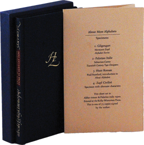
About more Alphabets. Specimens. -
Published by [New York:] [Typophiles] [2011], 2011
Seller: Antiquariat Tautenhahn, L�beck, Germany
Association Member: GIAQ ILAB VDA
Seller rating 5 out of 5 stars
4 Bll. in OKart.-Mappe, 17,5 x 11 cm. Enth�lt 4 kurze Texte zur Typographie in Satzmustern von Hermann Zapf Schriften: Gilgengart ("Alphabet Stories" von Zapf); Palatino Italic (Sebastian Carter, Twentieth Century Type Designers); Hunt Roman (Paul Standard, Introduction to About Alphabets) und Zapf Civilit� (specimen with alternate characters). - Gedruckt in der Kelly-Winterton Press; der Umschlag gesetzt in der Aldus roman und Palatino Kursiv. - Die Satzmuster waren in 75 signierten Exemplaren als Beilage zur Vorzugsausgabe von Jerry Kellys "Types of Hermann Zapf" erschienen (das vorliegende Exemplar allerdings ohne Signatur). - Der Umschlag mit Eselsohr und kleinem Fleck. Sonst gutes Exemplar auf gutem Papier.
-
ABOUT MORE ALPHABETS: THE TYPES OF HERMANN ZAPF
Published by The Typophiles, New York, 2011
Seller: Oak Knoll Books, ABAA, ILAB, NEW CASTLE, DE, U.S.A.
Association Member: ABAA ILAB MBS
Seller rating 5 out of 5 stars
Signed
hardcover, slipcase. Zapf, Hermann (illustrator). 4.5 x 7 inches. hardcover, slipcase. 112 pages. Foreword by Robert Bringhurst. Deluxe edition signed by the author and limited to 75 copies. Includes four type specimens in a paper folder and a slipcase for the book and specimen folder. Typophiles Chapbook, New Series, 3. "Letterforms are things that nearly all of us in the Western world have learned to take for granted. We treat them much like door knobs, water taps, thermostats, and hinges. We evidently think (in defiance of all logic) that what we read or write matters far more than how it's read or written, and that letterforms are just a way to get there, as a door knob is a way to open a door," writes Robert Bringhurst in the Foreword to About More Alphabets. This book hopes to bring attention to a neglected topic by focusing on the letterforms of Hermann Zapf. From metal type to digital characters, Hermann Zapf has composed exceptional type designs for seventy years. He can be considered one of the most important calligraphers of all time, as well as a most notable book designer and typographer. His typefaces are among the most beautiful and familiar in the world. This book, a companion volume to the Typophile Chapbook About Alphabets (1960, updated 1970), describes Zapf's post-1970 type designs and provides new research on many of the earlier types. In this volume, typographer and calligrapher Jerry Kelly describes the origins and history of numerous Hermann Zapf typefaces including Marconi, ITC Zapf International, Linotype Zapfino, and Zapf Civilit�. Kelly also includes new information on the Palatino nova and Optima nova families. This new Typophiles Chapbook is profusely illustrated with type specimens and drawings, many of which have never before been reproduced. Illustrations include drawings by Zapf, comparisons of various types, early sketches, typefaces never issued, and a twenty-eight page image section of type specimens. Other types described include Hallmark Textura, AMS Euler fraktur bold, Zapf Renaissance italic swash, Medici script, Aurelia, AMS Euler, Zapf Renaissance, ITC Zapf Chancery, and Zapf Civilit�. Robert Bringhurst calls Zapf one of history's greatest two-dimensional architects. He says, "Hermann Zapf has made letters so subtle, so lovely they bring tears to knowledgeable eyes. And there are very few people who know Zapf's work as well as Jerry Kelly. Read him and weep.".
-
PEN AND GRAVER : ALPHABETS & PAGES OF CALLIGRAPHY BY HERMANN ZAPF. WITH A PREFACE BY PAUL STANDARD. CUT IN METAL BY AUGUST ROSENBERGER
Published by Museum Books Inc. New York, USA, 1952
Seller: Marcus Campbell Art Books, London, United Kingdom
Association Member: ABA ILAB PBFA
Seller rating 4 out of 5 stars
First Edition
Hardback. Condition: Near fine. First Edition. 23 x 31cm near fine hardback with a text by Paul Standard followed by numerous examples of beautiful script in black and red.
-
Pen and Graver: alphabets & pages of calligraphy, by Hermann Zapf, with a preface by Paul Standard, cut in metal by August Rosenberger.
Published by Oblong 4to, 25, [5] leaves, illustrations, 23 x 31 cm, New York: Museum Books, 1952., 1952
First Edition
Hardcover. Condition: Fine. Dust Jacket Included. 1st Edition. One of 2,000 copies of the first edition in English of ''Feder und Stichel' (1950) printed in black and reddish-brown on one side of the leaf at the private printing-office of D.Stempel. The calligraphic pages were desiged during 1939-41 by Hermann Zapf. All the metal plates were cut by hand. Type: Palatino, designed by Hermann Zapf for the original German edition. Brown paper-covered boards decorated in blind, vellum spine titled in gilt. Blue paper dust-jacket. A fine copy. Scarce.
-
Pen and Graver: Alphabets & Pages of Calligraphy
Published by Museum Books, New York, 1952
Seller: Fahrenheit's Books, Denver, CO, U.S.A.
Association Member: RMABA
Seller rating 5 out of 5 stars
First Edition Signed
Hardcover. Condition: Near Very Good. No Jacket. Zapf, Hermann; Rosenberger, August (illustrator). First Edition. First edition, limited to 2,000 copies, inscribed by Zapf on the title page, the binding is beginning to crack at the head of the inner front hinge but otherwise remains solid. The book also has light bumps to the spine ends and cover corners, rubbing with areas of staining to the covers, a touch of peeling to the cover edges, minor foxing to the edges of the text block, mild discoloration along the spine, glue stains from a bookplate that has come loose to the front flyleaf, and shallow waving to the text block. Overall, a Near Very Good copy. Additional images available upon request.