
Order Total (1 Item Items):
Shipping Destination:

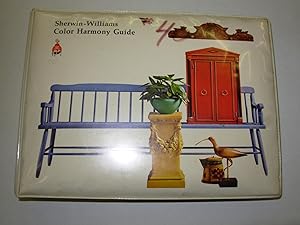
Sherwin Williams Color Harmony Guide (2 results)
Skip to main search results
Search filters
Product Type
- All Product Types
- Books (2)
- Magazines & Periodicals (No further results match this refinement)
- Comics (No further results match this refinement)
- Sheet Music (No further results match this refinement)
- Art, Prints & Posters (No further results match this refinement)
- Photographs (No further results match this refinement)
- Maps (No further results match this refinement)
- Manuscripts & Paper Collectibles (No further results match this refinement)
Condition Learn more
- New (No further results match this refinement)
- As New, Fine or Near Fine (No further results match this refinement)
- Very Good or Good (1)
- Fair or Poor (No further results match this refinement)
- As Described (1)
Binding
- All Bindings
- Hardcover (2)
- Softcover (No further results match this refinement)
Collectible Attributes
- First Edition (1)
- Signed (No further results match this refinement)
- Dust Jacket (No further results match this refinement)
- Seller-Supplied Images (1)
- Not Print on Demand (2)
Language (1)
Price
- Any Price
- Under � 20 (No further results match this refinement)
- � 20 to � 35 (No further results match this refinement)
- Over � 35
Free Shipping
- Free Shipping to U.S.A. (No further results match this refinement)
Seller Location
Seller Rating
-

Sherwin-Williams color harmony guide: [Super Kem-Tone color harmony guide. . .; Colors of America, inspirations for lovely rooms; Colors of America; Sherwin-Williams color harmony guide for interior decorating; Color harmony guide; The color harmony guide; Kem decorating guide: your "Easy-does-it" guide to decorating ideas and color selection. . . .
Published by Sherwin-Williams Co.], 1960; 1963-1964; 1966; 1968-1970., [Cleveland, OH:, 1960
Seller: Zephyr Used & Rare Books, Vancouver, WA, U.S.A.
Association Member: ABAA CBA ESA ILAB
Seller rating 5 out of 5 stars

First Edition
Seven vols. Oblong 8vo. 8.25 x 5.5 in. 166; 182 (i.e. 206); 182; 170; 171, [1]; 171, [1]; With colour photos, over 850 tipped-in paint samples, die-cut pie shapes throughout offering means by which designers. and home designers could set colour harmonies through the "windows;"2nd catalogue featuring half-sheet colour illustrations. Colour-illustrated boards on first, plastic-comb binding (minor damage to a couple of the plastic prongs, dustsoiling, edgewear), remainder of the vols. in vinyl-covered wire comb & 5-ring bindings (occasional dustsoiling, thumbing, edgewear, some w/ ink markings on pastedowns, or endsheets), still a remarkably good set. First editions, thus, or 9th, 12th, 13th, 15th, 17th, 18th, 19th Annual Editions, of these surprisingly scarce colour idea books designed specifically for the interior decorator, and home do-it-yourself decorator, emphasizing the importance of good colour harmonies, and selection of the Super Kem-Tone Paint colours within the home. The new Super Kem-Tone paints would dry in 20 minutes, were extremely washable, and the Kem-Glo enamels would dry in four hours. These "Color Harmony Guides" offer an essential visual and tactile reference for the evolution of colour styles and harmony throughout the 1960's. The 1960-1964 volumes focus on more muted, or natural pastel shades, with an emphasis in 1963-1964 on their Colors of America campaign which emphasized colours drawn from nature such as the red hues in the Bryce Canyon, UT arch, California Poppy orange hues, soft natural greens inspired by the forest colours in the Redwood Forest of California, early American colonial heritage colours. The 1966 "Color Harmony Guide" breaks away from the more muted pastels to the bold saturated colours of the mid-to-late 1960's, featuring mustard yellow, electric blue, fucshia, deep orange, and eye-popping vivid hues influenced by the rise of the psychedelic movement, and the "Mod" subculture which emerged out of Southern and Northern California. The 1966 "15th Annual" features heavily colour-saturated photos, juxtaposed near slightly muted paint colour samples, while the 1968 volume presents a far more striking and deeper hued paint samples, as well as harmony guide pages by which designers could plan their paint schemes. Almost none of these volumes are located in Worldcat except for the 1968 (1 copy at U of Cincinnati); See: Sherwin-Williams, Color Through the Decades: 1960s (2025); Marni Mervis, Popular Colors Through the Decades, Decades: 1920s-1960s, Dunn-Edwards Paints (2025).
-
Sherwin-Williams Color Harmony Guide
Published by Sherwin-Williams Co., 1967
Seller: Black and Read Books, Music & Games, Arvada, CO, U.S.A.
Seller rating 5 out of 5 stars
Hardcover. Condition: Very Good. No Jacket. 16th Annual Edition (1967). A VG oblong (8 in. x 6 in. tall x 1.5 in) color harmony guide. Unmarked and complete, but a few pages have paper clip creases or scuffs, and the last page and the rear inside cover have some specks near the binding. The loose leaf pages are securely bound in a five ring, white vinyl, notebook style binder. The padded front cover is a bit yellowed and '# 40' is written with a marker near the top edge. Light rubbing/soiling to the rear. With respect to the contents, '[c]olors are arranged in harmonizing groups, giving you at a glance a range of complementary tones and accents for any color you choose. First consult the introductory section, where colors are organized by families against backgrounds of room settings to select your basic hue. Then turn to the inside to see a swatch of your master color with its companion accents.' **Extra charges may apply to an order requesting expedited and/or international shipping because of the size and weight of this color guide.
