
Items related to Typography: A Very Short Introduction
Synopsis
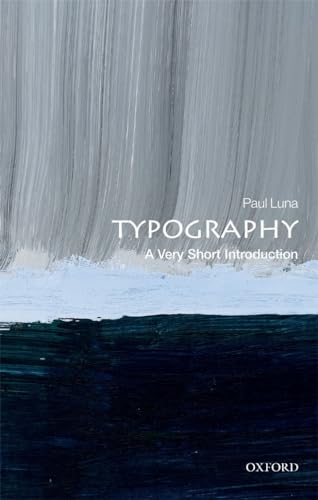
Typography, the art of designing printed words, was once the domain of an elite few artists but has become an area with which millions of people engage daily. The widespread usage of digital devices from laptops to tablets and smart phones which are used for written communications means that we are regularly asked to make decisions about the fonts, sizes, and layouts we use in our writing. This broadening engagement with the field of typography has led to a perceptible shift from debates about legibility and technicalities to conversations about which fonts best reflect the writer's personality or style .
In this Very Short Introduction, Paul Luna offers a broad definition of typography as design for reading, whether in print or on screens, where a set of visual choices are taken to make a written message more accessible, more easily transmitted, more significant, or more attractive. Considering the development of letterforms and the shapes of letter we use, Luna discusses the history behind our modern day letters and fonts, before considering the issues behind key typographic decisions, and the differences between printed and on-screen typography. Presenting any piece of typography as a fundamental design choice, Luna introduces the options available today, and explores the reasons why key typographic decisions are made.
ABOUT THE SERIES: The Very Short Introductions series from Oxford University Press contains hundreds of titles in almost every subject area. These pocket-sized books are the perfect way to get ahead in a new subject quickly. Our expert authors combine facts, analysis, perspective, new ideas, and enthusiasm to make interesting and challenging topics highly readable.
"synopsis" may belong to another edition of this title.
About the Author
Paul Luna is Emeritus Professor of Typography and Graphic Communication at the University of Reading. Before this he was head of corporate design at Oxford University Press and responsible for the design of major publications such as the Oxford English Dictionary, bilingual dictionaries, the Oxford Shakespeare, and the Revised English Bible.
"About this title" may belong to another edition of this title.
Search results for Typography: A Very Short Introduction

Stock Image
Typography: A Very Short Introduction
Published by
Oxford University Press, 2018
ISBN 10: 0199211299
ISBN 13: 9780199211296
Used
Paperback
Seller: World of Books (was SecondSale), Montgomery, IL, U.S.A.
Seller rating 5 out of 5 stars

Paperback. Condition: Very Good. Typography, the art of designing printed words, was once the domain of an elite few artists but has become an area with which millions of people engage daily. The widespread usage of digital devices from laptops to tablets and smart phones which are used for written communications means that we are regularly asked to make decisions about the fonts, sizes, and layouts we use in our writing. This broadening engagement with the field of typography has led to a perceptible shift from debates about legibility and technicalities to conversations about which fonts best reflect the writer's personality or style .In this Very Short Introduction, Paul Luna offers a broad definition of typography as design for reading, whether in print or on screens, where a set of visual choices are taken to make a written message more accessible, more easily transmitted, more significant, or more attractive. Considering the development of letterforms and the shapes of letter we use, Luna discusses the history behind our modern day letters and fonts, before considering the issues behind key typographic decisions, and the differences between printed and on-screen typography. Presenting any piece of typography as a fundamental design choice, Luna introduces the options available today, and explores the reasons why key typographic decisions are made.ABOUT THE SERIES: The Very Short Introductions series from Oxford University Press contains hundreds of titles in almost every subject area. These pocket-sized books are the perfect way to get ahead in a new subject quickly. Our expert authors combine facts, analysis, perspective, new ideas, and enthusiasm to make interesting and challenging topics highly readable. Seller Inventory # CIN0199211299VG
Stock Image
Typography: A Very Short Introduction
Published by
Oxford University Press, 2018
ISBN 10: 0199211299
ISBN 13: 9780199211296
Used
Paperback
Seller: World of Books Inc, Montgomery, IL, U.S.A.
Seller rating 4 out of 5 stars

Paperback. Condition: Very Good. Typography, the art of designing printed words, was once the domain of an elite few artists but has become an area with which millions of people engage daily. The widespread usage of digital devices from laptops to tablets and smart phones which are used for written communications means that we are regularly asked to make decisions about the fonts, sizes, and layouts we use in our writing. This broadening engagement with the field of typography has led to a perceptible shift from debates about legibility and technicalities to conversations about which fonts best reflect the writer's personality or style .In this Very Short Introduction, Paul Luna offers a broad definition of typography as design for reading, whether in print or on screens, where a set of visual choices are taken to make a written message more accessible, more easily transmitted, more significant, or more attractive. Considering the development of letterforms and the shapes of letter we use, Luna discusses the history behind our modern day letters and fonts, before considering the issues behind key typographic decisions, and the differences between printed and on-screen typography. Presenting any piece of typography as a fundamental design choice, Luna introduces the options available today, and explores the reasons why key typographic decisions are made.ABOUT THE SERIES: The Very Short Introductions series from Oxford University Press contains hundreds of titles in almost every subject area. These pocket-sized books are the perfect way to get ahead in a new subject quickly. Our expert authors combine facts, analysis, perspective, new ideas, and enthusiasm to make interesting and challenging topics highly readable. Seller Inventory # CIN0199211299VG
Seller Image
Typography: A Very Short Introduction
Published by
Oxford University Press, 2019
ISBN 10: 0199211299
ISBN 13: 9780199211296
Used
Softcover
Seller: Goodwill of Colorado, COLORADO SPRINGS, CO, U.S.A.
Seller rating 5 out of 5 stars
Condition: very_good. Item may have minor cosmetic defects marks, wears, cuts, bends, crushes on the cover, spine, pages or dust cover. Shrink wrap, dust covers, or boxed set case may be missing. Item may contain remainder marks on outside edges, which should be noted in Product Details. Item may be missing bundled media. Seller Inventory # COLV.0199211299.VG
Stock Image
Typography : A Very Short Introduction
Published by
Oxford University Press, Incorporated, 2019
ISBN 10: 0199211299
ISBN 13: 9780199211296
Used
Softcover
Seller: Better World Books, Mishawaka, IN, U.S.A.
Seller rating 5 out of 5 stars
Condition: Good. Former library copy. Pages intact with minimal writing/highlighting. The binding may be loose and creased. Dust jackets/supplements are not included. Includes library markings. Stock photo provided. Product includes identifying sticker. Better World Books: Buy Books. Do Good. Seller Inventory # 56735246-6
Stock Image
Typography: A Very Short Introduction
Published by
Oxford University Press, 2019
ISBN 10: 0199211299
ISBN 13: 9780199211296
Used
Paperback
Seller: ThriftBooks-Dallas, Dallas, TX, U.S.A.
Seller rating 5 out of 5 stars
Paperback. Condition: Good. No Jacket. Former library book; Pages can have notes/highlighting. Spine may show signs of wear. ~ ThriftBooks: Read More, Spend Less. Seller Inventory # G0199211299I3N10
Stock Image
Typography: A Very Short Introduction
Published by
Oxford University Press, 2019
ISBN 10: 0199211299
ISBN 13: 9780199211296
Used
Paperback
Seller: ThriftBooks-Dallas, Dallas, TX, U.S.A.
Seller rating 5 out of 5 stars
Paperback. Condition: Very Good. No Jacket. Former library book; May have limited writing in cover pages. Pages are unmarked. ~ ThriftBooks: Read More, Spend Less. Seller Inventory # G0199211299I4N10
Stock Image
Typography: A Very Short Introduction
Published by
Oxford University Press, United Kingdom, Oxford, 2018
ISBN 10: 0199211299
ISBN 13: 9780199211296
Used
Paperback
Seller: WorldofBooks, Goring-By-Sea, WS, United Kingdom
Seller rating 5 out of 5 stars
Paperback. Condition: Very Good. Typography, the art of designing printed words, was once the domain of an elite few artists but has become an area with which millions of people engage daily. The widespread usage of digital devices from laptops to tablets and smart phones which are used for written communications means that we are regularly asked to make decisions about the fonts, sizes, and layouts we use in our writing. This broadening engagement with the field of typography has led to a perceptible shift from debates about legibility and technicalities to conversations about which fonts best reflect the writer's personality or style . In this Very Short Introduction, Paul Luna offers a broad definition of typography as design for reading, whether in print or on screens, where a set of visual choices are taken to make a written message more accessible, more easily transmitted, more significant, or more attractive. Considering the development of letterforms and the shapes of letter we use, Luna discusses the history behind our modern day letters and fonts, before considering the issues behind key typographic decisions, and the differences between printed and on-screen typography. Presenting any piece of typography as a fundamental design choice, Luna introduces the options available today, and explores the reasons why key typographic decisions are made. ABOUT THE SERIES: The Very Short Introductions series from Oxford University Press contains hundreds of titles in almost every subject area. These pocket-sized books are the perfect way to get ahead in a new subject quickly. Our expert authors combine facts, analysis, perspective, new ideas, and enthusiasm to make interesting and challenging topics highly readable. The book has been read, but is in excellent condition. Pages are intact and not marred by notes or highlighting. The spine remains undamaged. Seller Inventory # GOR009989846
Buy Used
£ 2.50
£ 5.60 shipping
Ships from United Kingdom to U.S.A.
Ships from United Kingdom to U.S.A.
Quantity: 2 available
Stock Image
Typography: A Very Short Introduction
Published by
Oxford University Press, 2019
ISBN 10: 0199211299
ISBN 13: 9780199211296
Used
Paperback
Seller: WorldofBooks, Goring-By-Sea, WS, United Kingdom
Seller rating 5 out of 5 stars
Paperback. Condition: Fair. A readable copy of the book which may include some defects such as highlighting and notes. Cover and pages may be creased and show discolouration. Seller Inventory # GOR015139608
Buy Used
£ 2.50
£ 5.60 shipping
Ships from United Kingdom to U.S.A.
Ships from United Kingdom to U.S.A.
Quantity: 1 available
Stock Image
Typography: A Very Short Introduction (Very Short Introductions)
Seller: Lakeside Books, Benton Harbor, MI, U.S.A.
Seller rating 5 out of 5 stars
Condition: New. Brand New! Not Overstocks or Low Quality Book Club Editions! Direct From the Publisher! We're not a giant, faceless warehouse organization! We're a small town bookstore that loves books and loves it's customers! Buy from Lakeside Books! Seller Inventory # OTF-S-9780199211296
Seller Image
Typography : A Very Short Introduction
Seller: GreatBookPrices, Columbia, MD, U.S.A.
Seller rating 5 out of 5 stars
Condition: New. Seller Inventory # 31923094-n